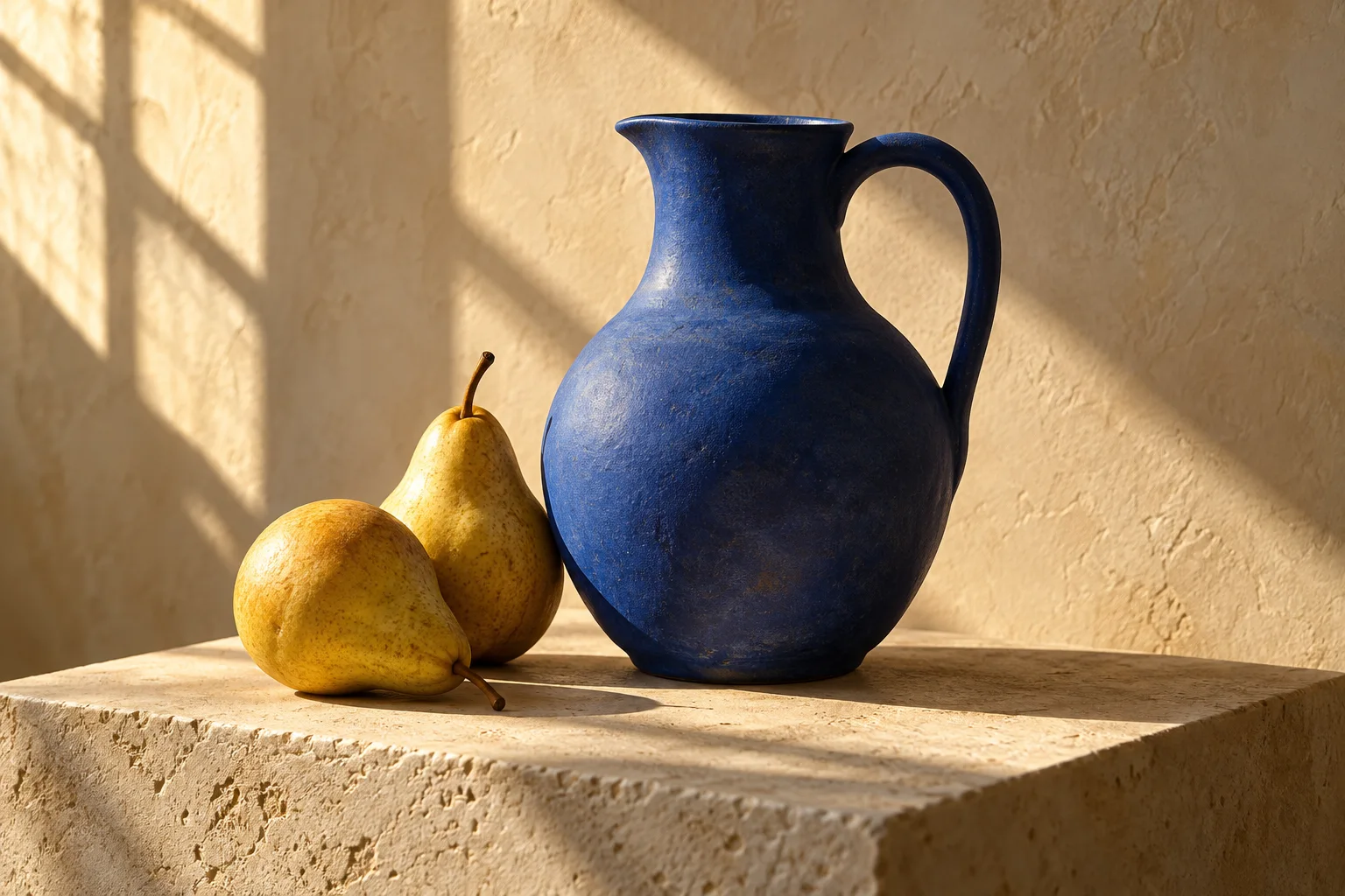
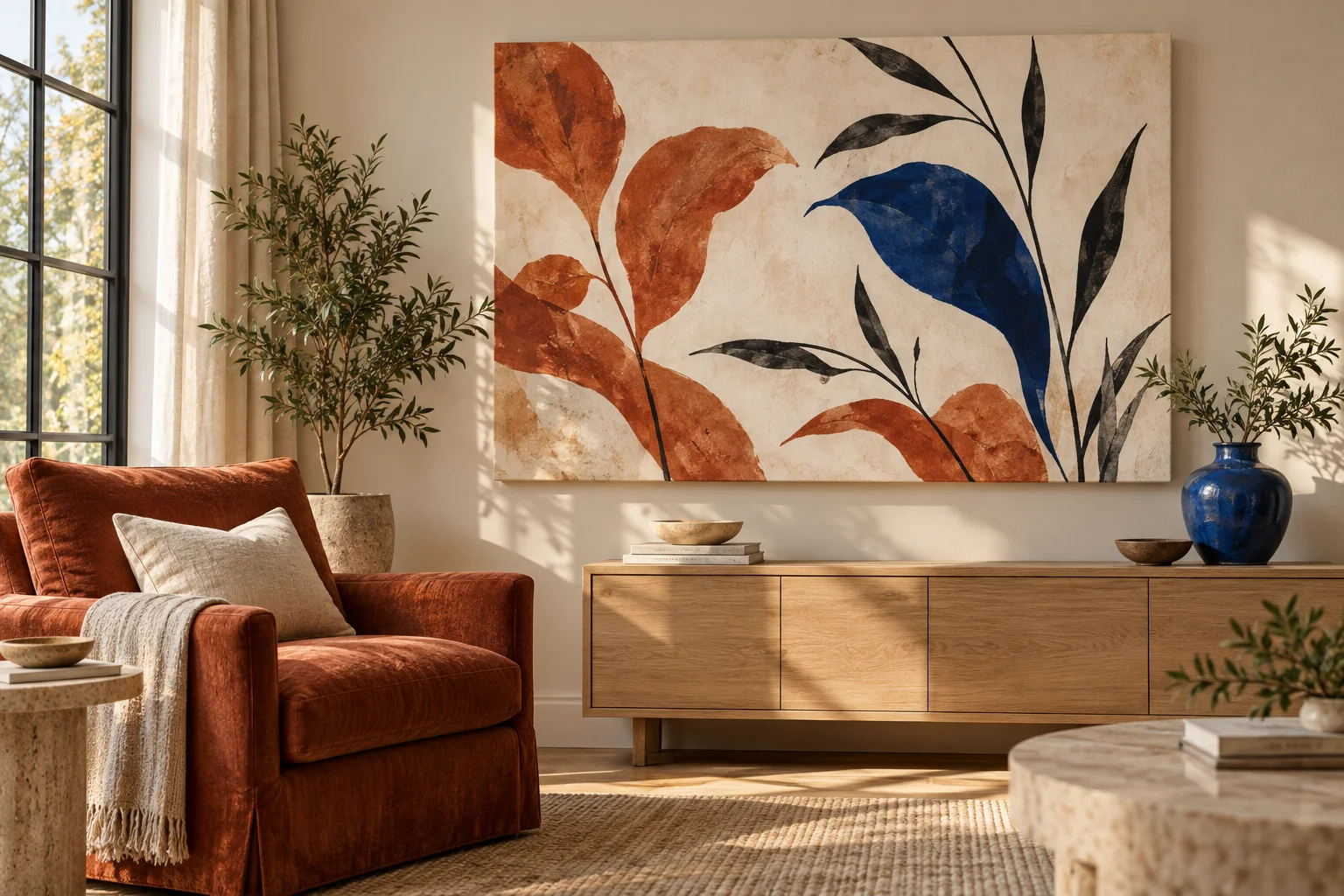
A print can belong in a room without matching every cushion. Often it needs just one connection: a blue that echoes a vase, a warm neutral that sits comfortably beside the wall, or a terracotta shape that picks up the chair.
Before you ask for an image, decide whether you want it to feel quiet or become the room’s focal point. Then give the colors specific jobs.
Choose three roles, not a long list of colors
Look at the room in the light you usually use it. Pick a background color, a supporting color, and an accent. In our illustrated reading corner, warm ivory gives the image breathing room, terracotta connects it to the chair, and cobalt repeats the vase.
- Background: the color that occupies most of the image.
- Support: a color used in larger shapes or secondary details.
- Accent: a stronger color used sparingly to catch the eye.
These are useful roles, not fixed percentages. If the generator uses all three equally, name which one should dominate and which should appear only once or twice.
Ask for the artwork itself
“Wall art for a cozy living room” can produce a picture of a living room with art on the wall. That is useful for imagining a space, but it is not the image you want printed.
For a printable design, be explicit:
Create only the flat, full-bleed artwork, not a room or product mockup. An abstract botanical composition with generous warm-ivory negative space, broad muted terracotta leaves, delicate charcoal stems, and one cobalt-blue curved leaf as the focal point. Refined matte painted texture, balanced asymmetry, no lettering, no frame, no furniture, no border.
The room in the header is an illustrative preview. The image you upload for printing should contain the artwork itself.
Decide how strongly the colors should speak
A quieter palette might use dusty blue and pale clay. A bolder one might use saturated cobalt and deeper terracotta. Neither is automatically better; compare them with the room’s existing objects.
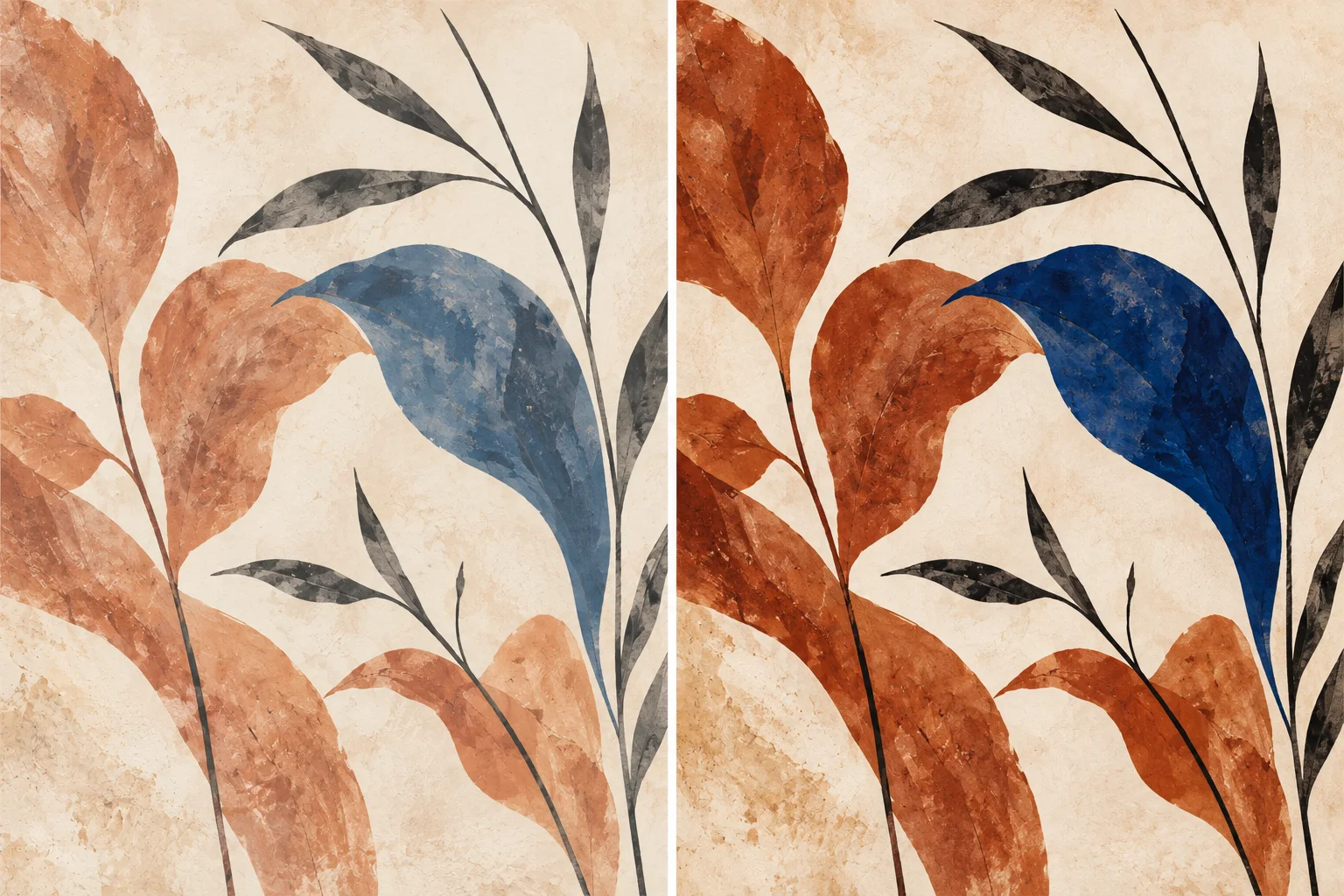
Try these revisions separately:
- Quieter: “Soften the cobalt to dusty blue and the terracotta to pale clay. Keep the background warm ivory.”
- More presence: “Keep the broad neutral background, but deepen the one cobalt leaf. Leave the other colors restrained.”
- More structure: “Add a few deeper charcoal stems without introducing another bright color.”
Separate color from contrast
If a print disappears against the wall, it may need a darker shape rather than a new hue. Contrast is the difference between lighter and darker areas. Saturation describes how vivid a color feels. You can increase one without increasing the other.
Ask for “a darker focal shape with the same muted palette” when the composition feels weak. Ask for “less saturated blue at the same lightness” when it feels too loud. These are creative directions, so review the result rather than expecting a precise color conversion.
Use a room photo for context
If your tool accepts a reference photo, say what it is for: “Use this room only as a color reference. Create a flat botanical image, not a new picture of the room.” Remove private details from the photo if you do not want to upload them.
A photo taken under warm lamps can shift every color. Look at the room in daylight too, and describe the colors in words rather than depending on one phone photo. Our reference-photo guide explains how to assign a clear role to an image.
Check the design before making it physical
View the image small and from farther away. Is there a clear focal point? Does the accent still feel restrained? Compare it with the room without turning the screen brightness all the way up.
A screen or generated room mockup cannot guarantee a printed color match. Material, lighting, and printing affect the result, so avoid treating a hex code or an attractive preview as a promise of identical color. If exact matching is essential, ask about your requirements before ordering.
Choose a canvas or poster shape that suits the composition. Keep the important leaf shapes clear of any crop or canvas wrap, and upload the flat artwork rather than the room preview.
When you are ready to print
Choose a product and its options, then upload your finished image or create one in the design step. Review the placement and adjust the crop before ordering. Automatic AI upscaling and print preparation are included with every order. Start with your best original file; preparation can increase working resolution and improve apparent detail, but it cannot reliably repair severe blur, incorrect anatomy, or garbled text.
About these examples
PrintAIArt created these illustrations with AI to explain the choices in this guide. They are illustrative examples, not a controlled comparison of image generators or a promise of identical results from the suggested prompts. Ordering guidance was reviewed on September 30, 2026.